Usage By Month
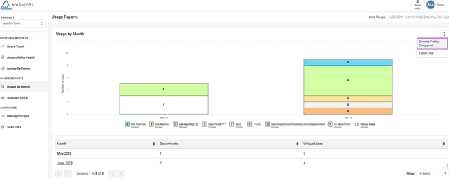
You use the Usage by Month chart to know the usage of Deque products and components for the selected dates based on departments or product components. This helps determine the number of users using the provided Deque products, and also know the departments and components being used.
The Usage by Month data displays the comparison for the last three scans (periods) before the end date and after the scan date. Select these dates, the date period, and the roll up frequency from the Date Range dropdown menu on the top right of the screen.
For example, if you select Monthly in the roll up data field, then the data shown is for the last three months. For example, if you select Weekly in the roll up data field, then the data shown is for the last three weeks.
This information is presented in both Grouped Bar Chart format and Unique Users Line format.
You can select or deselect the chart legends icons (Visible or Hidden) below the graph to view or delete the type graph from the chart.
Activating any bar in the chart triggers a drill down into the user score chart details for that period. Selecting any of the period in the table provides a filtered view on the same chart by period.
Marking the Unique Users Line chart as Visible automatically hides the stacked columns (bar chart view).
Usage Report Based on Product Components or Departments
You can view the usage of axe DevTools® products by departments or product components. Viewing the usage based on departments help you determine which teams need more support on accessibility.
To select reporting based on department, use the vertical ellipsis icon and select the toggle option Show by Department. For usage data without any department entry, the department section displays No Department.
Note: To view the usage reporting based on Product Component, use the toggle button Show by Product Component button.
Data Table View
In the Data Table view, the Usage by Month chart displays the data in a Data table with product components and unique users for each month. Activating the month drills down into further detailed levels with product component, user, and scan data details.
Use the Show dropdown menu to decide the number of rows of data to be displayed in the table view.
Export Data
You can export the data to either a JSON or CSV file by using the Export Data option. Activate the Kebab menu (three vertical ellipses icon) on the right side of the screen and select Export Data to either a JSON or a CSV file.
In the Export dialog box that displays, do the following:
- Select one of the following options that you want to export:
-
Page Charts: Select this radio button if you want to export the data table for charts that are displayed in the current screen.
-
All Charts: Select this radio button if you want to export the data table for all usage charts in a ZIP file.
- Select from either of the following format options that you want to export the data to:
- CSV
- JSON
- Activate the Export button.


