
Accessibility Program Chart
When your organization sends data to axe Reports for multiple axe products (axe Monitor, axe Auditor, or axe DevTools for Web), the Accessibility Program chart will show your progress across the software development lifecycle in one unified view.
With accessibility program charts, you can:
- Drive targeted improvements across your SDLC.
- Save time with personalized recommendations.
- Advocate for your accessibility program.
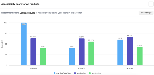
Accessibility Score for All Products
This column chart shows the progress of your accessibility program over time in one unified view. Each column shows the same accessibility score from the Score Trend charts for each product. The accessibility score is on the Y-axis, and correlates with the day, week, or month on the X-axis.
Common Trends
- When your DevTools for Web score are high, but your axe Monitor scores are low, consider whether fixes may not be getting released in production, or if accessibility issues are being released directly in production because of production-specfic updates, like publishing from a CMS.
- When scores are low in axe Auditor and axe Monitor, consider that manually-tested issues may not be getting fixed.
- If scores are stagnant, drill-in to the charts to look for driving factors, or discuss with your teams why accessibility isn’t improving.
- Spotty data indicates that some teams are not testing regularly for accessibility. Use the filters to see which sites are being tested regularly.
- When your DevTools for Web score increases over time, you can share the positive news with leadership, and show that your accessibility program is becoming more efficient and cost-effective over time.
Recommendations
If your most recent data points show a negative trend for any product, axe Reports will highlight the area of your business (a “subdimension” identified by your axe Reports admin), or site which needs the most immediate attention. When there’s a negative trend, axe Reports will examine the dimension with the lowest score for that product. The lowest-scoring subdimension (or project, test case, script if no dimensions exist) will be recommended for further investigation.
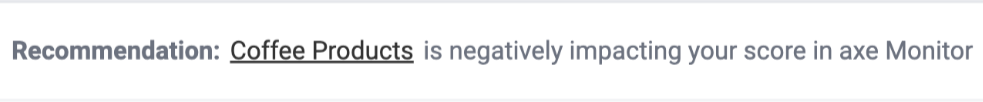
For example, if your chart is set to show monthly data from May to July, and the DevTools for Web & Auditor scores were stagnant, but the axe Monitor score dropped by 20% from June to July, then axe Reports will examine which Dimension with axe Monitor scans has the lowest score in July – consider that it’s “Regions.” axe Reports will recommend that you examine “EU Sites,” the subdimension with the lowest scores in “Regions” in July.
View SDLC Progress For Specific Business Areas
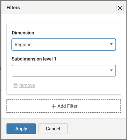
Use the Filter button to view the accessibility score for a specific Dimension or Subdimension across axe DevTools Web, Auditor and axe Monitor. The Dimension must contain data from each product to show data in this view. To Filter by multiple dimensions and get a cross-section of your accessibility program:
- Select “Filters” from the Accessibility program chart.
- Choose a dimension from the dropdown. Optionally, select one or more subdimensions.
- Select “+ Add Filter.”
- Choose another dimension from the dropdown, and optionally select more subdimensions.
For example, you can filter by the Regions dimension and “EU Sites,” as well as by the Products dimension, and the “Coffee Products” subdimension. This will provide accessibility scores across axe products for coffee product sites in Europe.
What’s causing my score?
Select a column from the chart or a score from the table to find which scans, test cases, or scripts are causing the current score. The page that loads will show a table, sorted by lowest to highest score, showing all Dimensions (or scans, test cases, scripts if no Dimensions have data for the product/period selected).
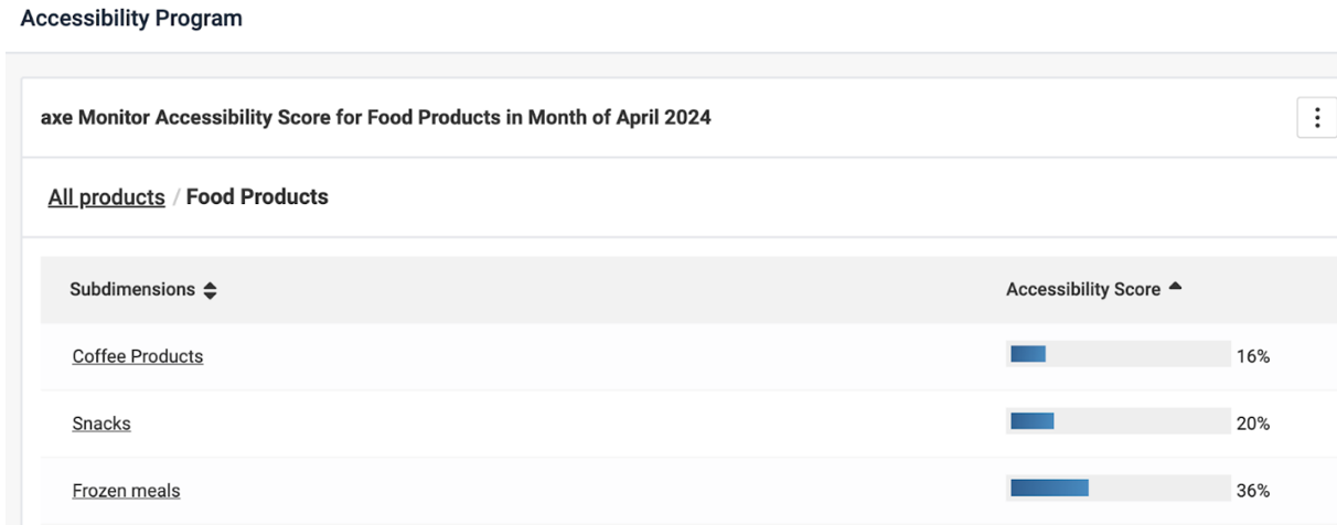
Observe where the lowest scores are coming from, and select a row to find the root cause. Learn more about the accessibility scores.
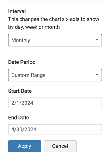
Date Range
Select the date drop-down after the chart header to modify the date range of the data shown on the Accessibility Program Chart.
- Select an interval to change the chart's x-axis to show by day, week or month.
- Choose a date period: custom range, or the last 3, 6, or 12 last months.
- If custom range is selected, enter the month, date, and years you want to show on the chart.
Note: Selecting a long range or frequent interval (like daily or weekly) may show a chart that’s difficult to understand or slow to load.
Permissions
Note: When a user belongs to a team that only allows access to one of these products in axe Account, the Accessiiblity Program chart will not show. The user can continue to navigate to any products’ charts they do have permissions to view.