Auditor User Guide Organization and Conventions
Since the User Interface (UI) of the axe Auditor product was carefully designed to meet the manual accessibility testing needs of accessibility specialists, this user documentation set is organized much in the same way. Based on user research and evaluation, surveys, user stories, and commonly-performed use case scenarios, our experts have spent the last two years refining the accessibility testing, issue prioritization, and report-building process that we use on our clients’ websites to establish and refine The Deque Way of accessibility testing and its associated guided accessibility testing tool, axe Auditor. Therefore, you'll find the table of contents of this guide just as intuitive as the UI itself, thereby making it all the more convenient as a companion to using the application.
The top main menu and the quick page links in the axe Auditor user interface.
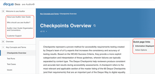
The left sidebar contents menu and the quick page links within the page in this user guide.
Regardless of whether you are starting fresh with a new project, or jumping back in to an in-progress existing one, you'll find it intuitive to use this documentation as a familiar reference. So, if you are rerunning tests on new builds and multiple browsers, verifying that requirements have been met, creating precise and consistent accessibility issue reports for developers, or creating comprehensive reports for management, finding the right "how-to" information for those less commonly-performed tasks will be just as easy as picking up where you left off in a test run in axe Auditor itself, and the search, contents, index, breadcrumb, and cross-reference links throughout help you get what you need quickly.
-
Conventions employed in this document are believed to be inherently understandable for the intended audience, however, they are also briefly explained below. This documentation employs consistent use of style formatting to make it easy to scan. They include:
-
Structure: As noted earlier on this page, the structure of this documentation set generally mirrors the user interface, as you would read from left to right, top to bottom, and attempts to make information available where it is needed without redundancy.
-
Titles and Headings: Procedure titles typically begin with a gerund in headings that clearly identify the information that follows.
-
Caution, Note, Important: Alerts such as those providing prerequisite, conceptual or supplementary information necessary to the completion of a task appear as notes against colored backgrounds enclosed within rounded-corner borders to call your attention to them.
-
Text Formatting: This documentation set uses the typographic convention of bold (strong style) as formatting to clearly identify "clickable" user interface elements such as buttons in procedural instructions, or as introductory phrases to introduce them.
-
Sample Input: Preformatted code snippets and examples are subject to being highlighted and/or formatted appropriately to provide you with the adequate indentation and line spacing as necessary. Typically this will employ use of an offsetting font such as
Courier New. -
Graphical Images: Screenshots are used for demonstration purposes only, but when possible, reflect actual selection data and real entry examples. Such graphics are positioned near the text they support and are provided with alt text.
Direct Documentation Feedback: Audience (reader) feedback on this documentation set, regardless of your end-user role, is among the most valuable input we receive and is always welcome! To submit feedback on this user guide (and online help system) at any time, you may either use the general feedback form within the axe Auditor application user interface itself, the general help desk contact information below, or send an email to axe-auditor-feedback@deque.com.

