Guide to Supporting Text Scaling
Android applications must scale content to ensure no loss of information or functionality for users requiring larger font sizes to conform to WCAG 1.4.4 Resize Text. Information should be made available to everyone. This guide will cover recommended ways to support scaling text to ensure the user experience is suited for everyone.
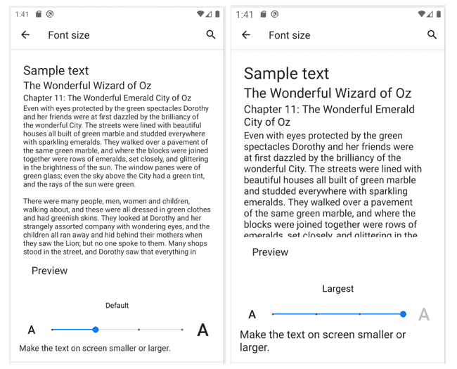
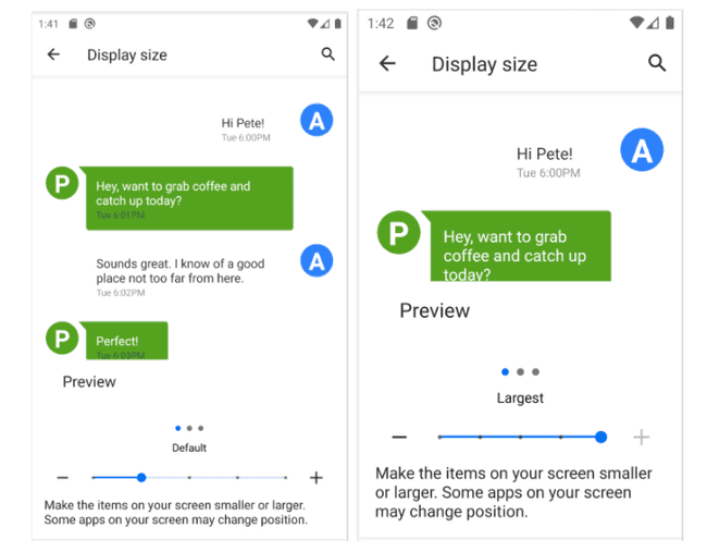
For Android devices 13 and up, there's an accessibility setting to change the preferred text and content size. Read more on changing these settings in Google's support guide for text and display settings.
Prepare Your View
Before supporting scalable text, your application's views must be ready. Read the below considerations before implementation.
ScrollView
Anytime there's text on the screen, it should conform to the user's preferred text and display settings. For a larger font, it doesn't take much for text to overflow off-screen. This is where having a ScrollView element as the container for the layout element (constraint, linear, relative) is imperative to making the text available as extends past screen bounds. Note that ScrollViews will not scroll until the screen's height (or width for horizontal scroll) is filled.
Exceptions:
RecyclerViewsdo not need to be embedded within aScrollView. Instead, allow the items to expand either vertically or horizontally in their height/width to allow the text to scale.- Navigation elements in bottom bars, tabs, toolbars, etc, should be at the same level as the containing
ScrollView, not within theScrollView. It's recommended to only use one static view at a time to not restrict the viewport too much.
<androidx.constraintlayout.widget.ConstraintLayout
    android:layout_width="match_parent"
    android:layout_height="match_parent">

    <include layout="@layout/custom_toolbar"/>

    <ScrollView
        android:layout_width="match_parent"
        android:layout_height="wrap_content"
        app:layout_constraintTop_toTopOf="parent"
        app:layout_constraintStart_toStartOf="parent">

        <androidx.constraintlayout.widget.ConstraintLayout
            android:layout_width="match_parent"
            android:layout_height="wrap_content"
            tools:background="@color/cauldron_main_bg">
            <TextView...>
            <TextView...>
            <androidx.constraintlayout.widget.Guideline...>
            <androidx.constraintlayout.widget.Guideline...>
            <androidx.constraintlayout.widget.Guideline...>
        </androidx.constraintlayout.widget.ConstraintLayout>
    </ScrollView>
</androidx.constraintlayout.widget.ConstraintLayout>
ConstraintLayout
ConstraintLayouts are great for the scalability of text due to the flexible abilities and guides you can define. Most text resizing issues can be resolved by not restricting the height or width of a view. By allowing a TextView to expand with constraints set, the view understands how to grow with the text view, and as such the text is always available to the end user and not truncated or off-screen.
A common practice is to set the view's width to match the parent, while the height is set to wrap content. This allows the view to remain at the defined width, but the height can adjust for any content inside that may change in size or length (consider the text changing based on state.) Another option would be to set android:layout_width to 0dp allowing the component to fill the space between any start and end constraints. Always check components can expand vertically to accommodate growing text in this scenario.
<Button
    andriod:id="@+id/logIn"
    android:layout_width="0dp"
    android:layout_height="wrap_content"
    android:layout_marginStart="8dp"
    android:layout_marginTop="16dp"
    android:layout_marginEnd="8dp"
    android:layout_marginBottom="24dp"
    android:text="Login"
    app:layout_constraintEnd_toEndOf="@+id/right"
    app:layout_constraintStart_toEndOf="@+id/left"
    app:layout_constraintTop_toBottomOf="@+id/password" />
RelativeLayout
RelativeLayouts are a bit less flexible than ConstraintLayouts. Be sure to define the start and end guidelines for sibling elements so that components are on-screen and readable.
LinearLayout
LinearLayouts can adjust to changing content sizes if they are in a ScrollView and do not set a match_parent height in itself, or any child LinearLayout. If a specific height is needed, use the android:minHeight attribute as the default size.
<LinearLayout
    android:layout_width="match_parent"
    android:layout_height="wrap_content"
    android:layout_marginTop="16dp"
    android:minHeight="30dp">
Changing Content
The below sections highlight some of the Android settings available to alter the content size in various ways. Make sure your views respond to growing content to keep content available on the screen and free from any ellipsis or truncation.
Scaling Text

Increased font size can be useful for many users with visual impairments. You should always honor the user's preferences when it comes to setting font size within your application.
Display Size
Display Size alters the overall size of elements on the screen benefiting users with impaired motor function and/or users with visual impairments.

Text Size
When it comes to sizing widgets you'll find in Android two measuring units: DP or DIP for density-independent pixels and SP or SIP for scale-independent pixels. Any text should use SP to maintain consistency across devices and support font scaling. Utilize Android Studio's accessibility linter to display a warning if SP wasn't used on TextViews.
You may encounter scenarios where partial text modification is needed, an inline link for example. For TextViews, you can use SpannableStringBuilder to modify the text directly or modify the size of the text with AbsoluteSpanSize. Avoid hard-coded sizes to support scaling.
SpannableStringBuilder str = new SpannableStringBuilder(tv.getText());
str.setSpan(new AbsoluteSizeSpan(size: 70, dip: true), start:15, end:18, Spannded.SPAN_EXCLUSIVE_EXCLUSIVE);
tv.setText(str);
Widget Considerations
A few tips to utilize Android native components and ensure a good accessibility experience.
Toolbar: If using a toolbar, we recommend a short title to provide context. If you are using a dynamic title, we recommend not using theToolbarwidget.BottomNavBar: Distinct iconography with descriptive content descriptions will help provide the much-needed context for navigating without the risk of having labels overlap.Tabs,ViewPager,TabList, and more: Utilize a scrollable view, if needed, so a user can interact with the application with the full context of the information available to them. Do not limit the height of a control.
