
Linting Custom Components with the Axe Accessibility Linter for VS Code or JetBrains IDEs
A walkthrough for linting custom components in VS Code or JetBrains IDEs
This article shows how to configure the Axe Accessibility Linter extension for Visual Studio Code (VS Code) or the plugin for JetBrains to find accessibility errors in your custom components.
This article is for users of the Axe Accessibility Linter extension for VS Code and the plugin for JetBrains. If you are a user of the Axe DevTools Linter REST endpoint, see Linting Custom Components with the REST Endpoint instead.
If you would like to read an overview of linting custom components, see Linting Custom Components.
To use this walkthrough, you should have the following installed:
For Visual Studio Code:
For JetBrains IDEs:
An Example Accessibility Error
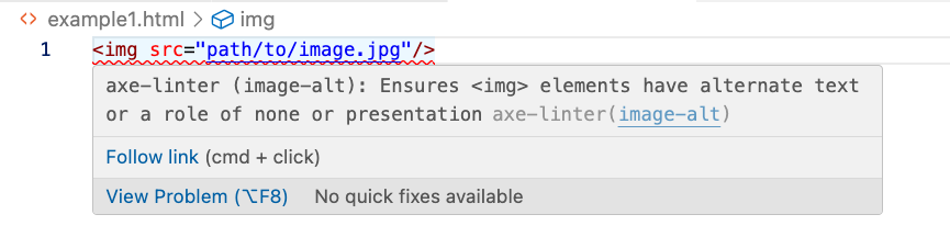
When you use the extension to lint source code, any accessibility errors are shown in your IDE with a red wavy underline. For example, the following HTML shows the use of the img element without an alt attribute, which is an accessibility error (shown in VS Code).
<img src="path/to/image.jpg"/>(This is an oversimplified example for demonstrating linting rather than an actual real-world example.)
The extension highlights the line in error and provides a tooltip when you hover your mouse cursor over the error. Because this img element doesn't have an alt attribute, you'll get an accessibility error from the extension in your IDE (VS Code is shown):
A Custom Image Component
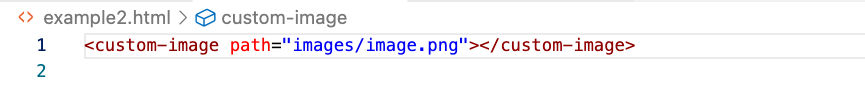
For this example, a developer created a custom component called custom-image. The following sample shows example usage of the custom-image custom component:
<custom-image path="images/image.jpg"></custom-image>For this example, the custom-image component creates an img element with a path attribute (which is mapped to a src attribute by the custom control's implementation). The extension shows no error because the extension has no mapping between custom-image and img even though the output img element is missing an alt attribute:
Mapping custom-image to img
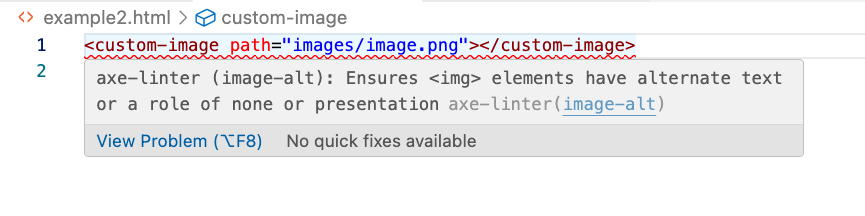
If you provide a mapping between custom-image to img, Axe DevTools Linter can map your custom component as a standard HTML element and locate accessibility errors. You can specify the mapping by using the global-components configuration option in an axe-linter.yml configuration file:
global-components:
  custom-image: img
The extension now highlights the accessibility error and provides a tooltip when you hover your cursor over the error:
You can also indicate the same mapping as above with either of these syntaxes:
global-components:
  custom-image:
    element: img
Or, alternatively, by abbreviating element as el:
global-components:
  custom-image:
el: imgWhen you use an element mapping, all attributes from the custom component are copied to the emitted element, and that emitted element is linted.
Fixing the Accessibility Problem
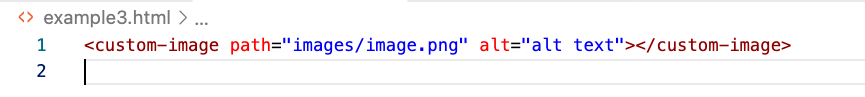
You can add an alt attribute to your custom-image to fix the accessibility problem:
<custom-image path="images/image.jpg" alt="alt text"></custom-image>There is no longer an error so your IDE no longer displays the red wavy undeline (VS Code shown):
Mapping an alternative-text Attribute
If your custom image component instead uses a different attribute to indicate alternative text, you can specify that attribute in the configuration. For instance, suppose your custom-image component uses an alternative-text attribute instead of alt, as shown below:
<custom-image path="images/image.jpg" alternative-text="alt text"></custom-image>In this case, you could specify a mapping between the alternative-text attribute and the alt attribute as shown with the attributes array in an axe-linter.yml file as shown below:
global-components:
  custom-image:
    element: img
    attributes:
      - alternative-text: alt
This global-components configuration is slightly different from the earlier mapping of one custom component to one HTML element. With only elements, you use a mapping from a key (custom-image) to a value (img). With the inclusion of the attributes array, you are now required to use the element (or el) property to specify the emitted HTML element.
This change fixes the error, and there is no red wavy underline shown in your IDE (VS Code is shown).
Because you specified the attributes array in the configuration, when the extension maps from custom-image to img, only the attributes matching those in the attributes array are copied to the emitted HTML element.
You can also abbreviate attributes as attrs:
global-components:
  custom-image:
    element: img
    attrs:
      - alternative-text: alt
Special Attribute Values: <text> and aria-*
Suppose you use a custom-button component as follows:
<custom-button aria-controls="expand-region" aria-expanded="false" aria-colindex="1" message="Show Region"></custom-button>(The custom button will, using JavaScript and CSS that isn't included here, hide and show a div.)
There are two problems with this usage:
- If you map this
custom-buttoncomponent directly to abuttonelement, there will be no text content to be displayed on the button. The component author's intent, however, is that themessageattribute should be used as text content:<button>value of themessageattribute</button> - The emitted
buttonelement has an implicit role ofbuttonso thearia-colindexattribute is incorrect and should be removed.
As is the default, this HTML will not result in an error because there is no mapping between custom-button and button. However, if you create a simple mapping between custom-button and button as shown below:
global-components:
  custom-button: button
You will receive two errors from your IDE (VS Code is shown):
The Special <text> Value
To address the first problem (text content for the button element coming from a message attribute, identified above as button-name in your IDE's tooltip), you can use the special <text> value which maps an attribute to the emitted element's text content. In this case the message attribute's text should be copied to the emitted button element's text content.
To configure the extension that the message attribute should be considered as text content for the HTML button element, you can use the special <text> value in an axe-linter.yml configuration file:
global-components:
  custom-button:
    element: button
    attributes:
      - message: <text>
Because you defined the message attribute as <text>, you told the extension to consider that attribute as replacing textual content of the HTML button element with the value of the message attribute.
Unfortunately, by using the attributes array, the only attribute that was passed through to the emitted button element was only the message attribute; any attributes not in the attributes array are not passed through. This means that the incorrect aria-colindex was not caught by the extension.
Using aria-*
You can use the special aria-* value to pass all the ARIA attributes, as shown below:
global-components:
  custom-button:
    element: button
    attributes:
      - message: <text>
      - aria-*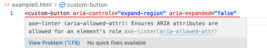
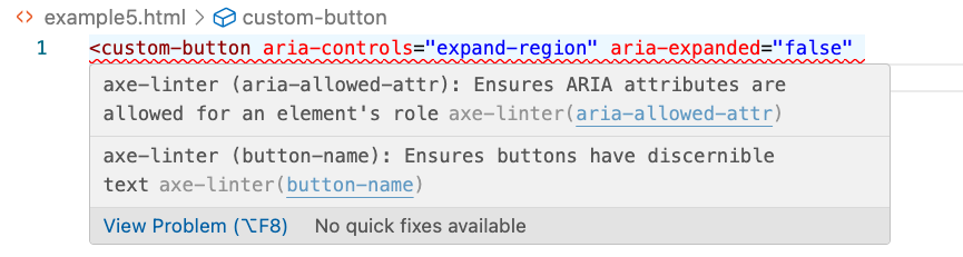
This error occurs because the button element has an implicit role="button" and using aria-colindex is invalid with buttons. With aria-*, all ARIA attributes are copied to the emitted element; this includes copying the invalid aria-colindex attribute.
<element>
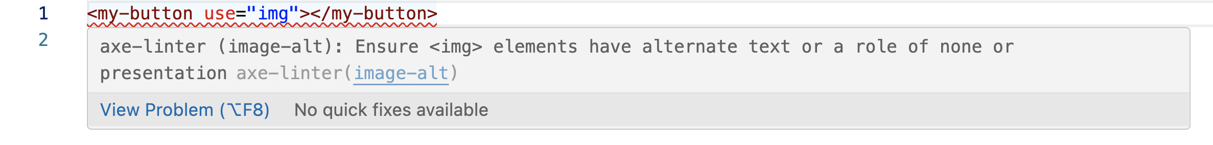
With complex components, you might want to emit a different HTML element than the default element in specific cases. For instance, you might have a button component that typically behaves like a button and, in other states, like a placeholder image. The <element> value lets you specify an attribute on your custom component that determines the emitted element.
global-components:
  my-button:
    element: button
    attributes:
      - use: <element>
In this case, the use attribute on the my-button component indicates the element to emit. Because the emitted img element doesn't contain an alt attribute, you'll receive an error:
Passing All Attributes Implicitly
If you'd used only element mapping (where the mapping does not use the attributes array), all attributes would be, by default, copied to the button element. The configuration for this case was shown earlier:
global-components:
  custom-button: button
Along with the error shown in your IDE (VS Code is shown here):
The above example shows that a practical first step when beginning to lint custom components would be to start with an element mapping (thereby copying all attributes to the emitted, standard HTML element) and then seeing what attributes need to be added to the configuration:
- Whether any of the custom component's attributes should be mapped to different attributes.
- Whether you need to use
<text>oraria-*.
Default Attributes
Default attributes let you set values for attributes in your configuration file rather than map one attribute to another. For example, the following sample configuration shows a custom-menu component mapped to an li element with a role of menu:
global-components:
  custom-menu:
    element: li
    attributes:
      - role:
          name: null
          default: menu
Because the role attribute has a default value of menu, set in the configuration file, users do not need to specify a role attribute when they use the custom-menu component in their code. The implication is that your custom component's implementation creates these attributes on the output element and sets their values rather than requiring users to set them when they use your component.
Optionally, the name value is set to null in the configuration, which causes Axe DevTools Linter to ignore any role attributes that users have specified on custom-menu in linted code.
The value specified with default should be a string.
See Also
Configuring Axe DevTools Linter
Custom Components and the REST Endpoint
Preconfigured Component Libraries