Issues By Period
Not for use with personal data
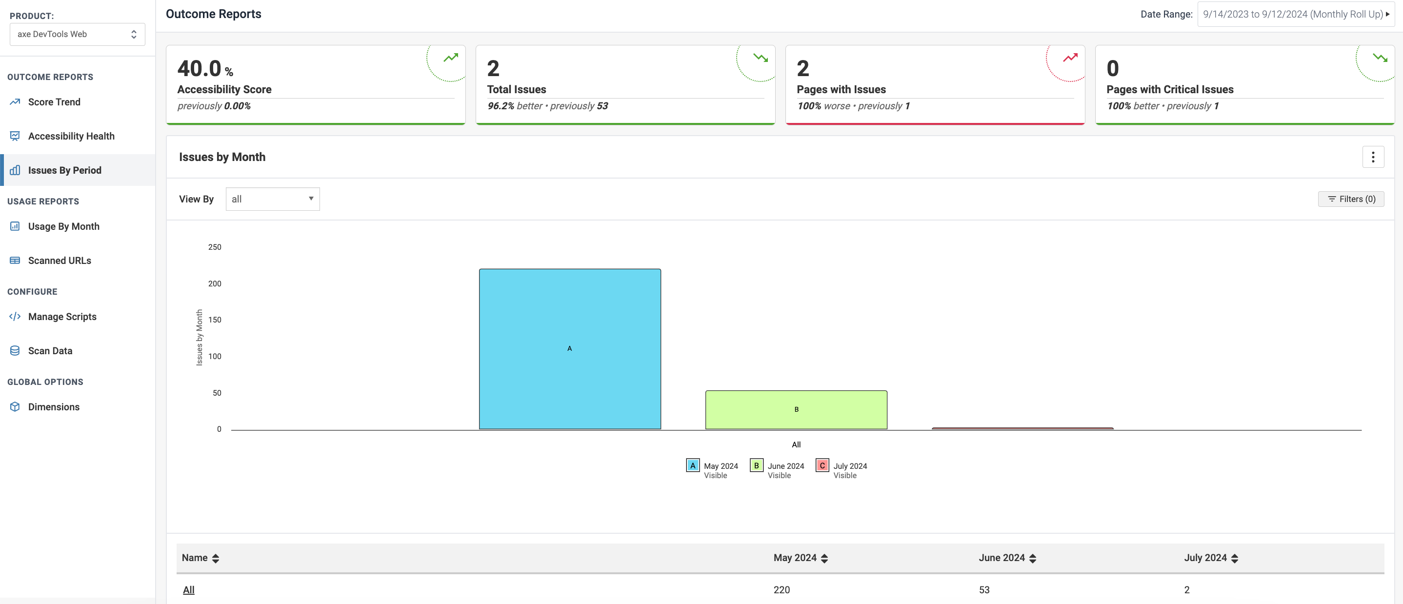
This chart captures how your issues are trending with the total number of accessibility issues rolling up to the period you've selected. The default period is Issues by Month, and the chart represents each month in your selected start and end dates if data exists for that period. If you selected 'Week' or 'Day' in the roll up selection, the chart filters the data to reflect your selection and renames the chart accordingly.
This information is presented in a Grouped Bar Chart format, by default. Clicking any bar in the chart triggers a drill down into the comprising hierarchy levels for that period. Selecting any of the period in the table provides a filtered view on the same chart by period.

