
Label at Front
Learn how we're using artificial intelligence for this rule!
What We Check For
If an interactive element has a visible label, this should come at the beginning of the name announced by assistive technology (AT), before any extra information.
Failing Example ❌
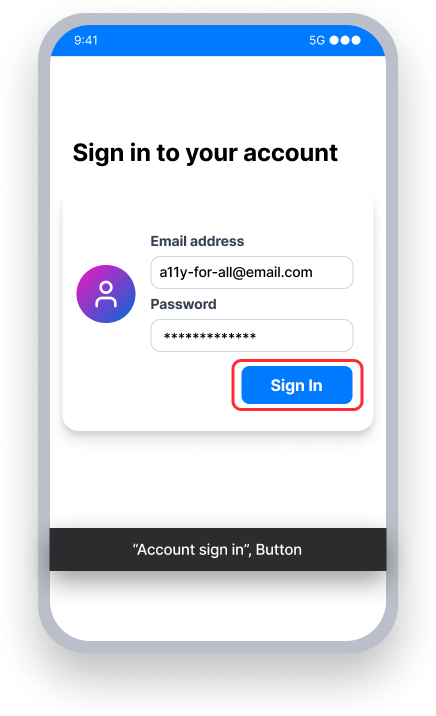
The button name is "Account sign in"
TalkBack announces "Account sign in, button" —-the visible label "Sign In" is not at the front
Voice Access - User speaks "Sign In"
This may not activate the button since the name starts with "Account", not "Sign In"
Passing Example ✅
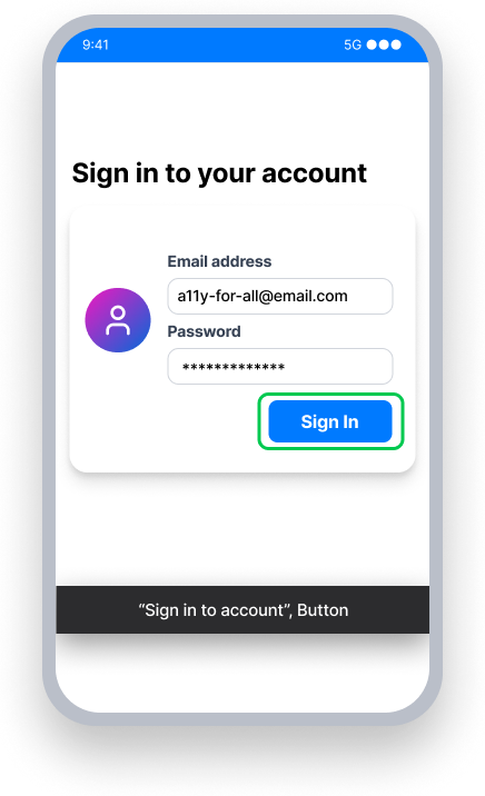
The button name is "Sign in to account"
TalkBack announces "Sign in to account, button" - the visible label "Sign In" comes first
Voice Access - User speaks "Sign In"
This activates the button because the name starts with the visible label
At a Glance
- This rule has a minor impact for users, enforcing a WCAG Best Practice
- Visible text first: Always begin an element's name with exactly what sighted users perceive on the screen
- Context second: Add helpful information to the element's name after the visible text
Impact to Users
People who use assistive technology need to quickly understand what an element does and be able to easily interact with it. When extra words come before the accessible name, this slows navigation and makes your app less efficient for AT users.
- Talkback - Some users switch between modalities — using both a screen reader and voice input. Consistency in placing visible text at the start of the name reduces confusion when comparing what a sighted user can perceive versus what is announced by Talkback.
- Voice Access - Speech recognition engines often rely on the beginning of an accessible name to resolve which element the user is targeting. Putting the visible label at the start of the accessible name makes the match unambiguous, and reduces the possibility of a user not being able to activate an element.
A best practice we recommend is only having an element's visible text within the name, and putting secondary information within the accessible value, hint, or role.
Note: Depending on the programming language, the 'name' property for an element may be called something different. For XML or Compose, is is called content description. For React Native, it is called an accessibility label.
Confirm Label at Front Issue
- Turn on TalkBack
- Focus the element
- One of the following will happen:
- Inaccessible: The text first announced by TalkBack is different from the element's visible text
- Accessible: TalkBack will announce the element's visible text first
Fix Issues
To resolve Label at Front issues, match the text content and accessible name exactly when possible. Avoid the use of extraneous words such as "Click here to..." or "Tap to...", and name the element in a way that explicitly tells the user its action.
At times it is necessary to expand an element's accessible name to include more context. For example:
- Visible Label: “Inbox, 5”, Name: “Inbox, 5 unread messages”
- Visible Label: “Delete”, Name: “Delete User Profile”
To avoid Label at Front issues in cases such as these, make sure the element's visible text comes first in its accessible name.
XML
For a button with visible text that says "Send":
<Button
   android:id="@+id/email_button"
   android:layout_width="wrap_content"
   android:layout_height="wrap_content"
   android:layout_marginTop="@dimen/xlg"
   android:text="Send"
   app:layout_constraintStart_toStartOf="parent"
   app:layout_constraintEnd_toEndOf="parent"
   app:layout_constraintTop_toBottomOf="@id/divider2" />
The visible text for the button comes first in its content description, and additional information follows.
val button = findViewById<Button>(R.id.email_button)
button.contentDescription = "Send Email"
Compose
For a clickable text element with visible text that says "Send", the visible text for the button comes first in its contentDescription, and additional information follows.
Text(modifier = Modifier.semantics { contentDescription = "Send Email" }, text = "Send")React Native
The accessibilityLabel property should start with the element's visible text.
By default, a button will use its title as its accessibilityLabel, and therefore it will pass this rule.
<Button
   title={'Menu'}
   mode='contained'
   accessibilityLabel='Menu'
/>
If you choose to customize the accessibilityLabel for a button, ensure it starts with the text of the title.
<Button
   title={'Log In'}
   mode='contained'
   accessibilityLabel='Log In to Transfer Money'
/>
When setting the accessibilityLabel explicitly, ensure that the accessibilityLabel begins with the element's visible text.
<View style={styles.container}>
   <Button title='Menu' accessibilityLabel='Menu: Tap to expand/collapse'>
</View>
Can I Ignore This Rule?
The Label at Front rule enforces a best practice noted by WCAG as part of WCAG 2.1 2.5.3 A. This rule has a minor impact and can be ignored if you want to prioritize more serious issues. You can turn off rules categorized as 'Best Practice' from the Mobile Dashboard, or by ignoring the rule in tests written for Android.
Frequently Asked Questions
Are there any known limitations with this rule?
Yes. A rule failure may result when an interactive element's visible text contains an abbreviation (e.g. "GB", "km") or an obscured / truncated identifier, and the accessibility announcement consists of the represented words (e.g. "gigabytes", "kilometers"), even though this is the recommended pattern for making abbreviated or truncated content screen-reader friendly.
Resources
- Web Content Accessibility Guidelines (WCAG) 2.1, W3C Recommendation
- WCAG 2.1 Understanding Docs