
Label In Name
Make app buttons and controls clear for everyone
Learn how we're using artificial intelligence for this rule!
What We Check For
If an interactive element has a visible label, the name announced by assistive technology (AT) should be the same.
Failing Example ❌
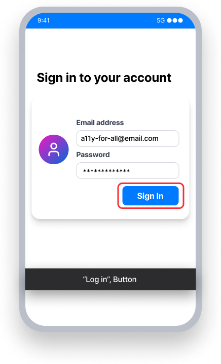
The button name is "Log in"
TalkBack announces "Log in, button" - mismatching the visible label "Sign In"
Voice Access - User speaks "Sign In"
This won't activate the button because its name is "Log in", not "Sign In"
Passing Example ✅
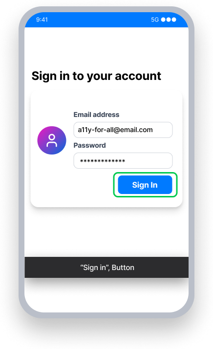
The button name is "Sign In"
TalkBack announces "Sign In, button" - matching the visible label
Voice Access - User speaks "Sign In"
This activates the button because the name matches the visible label
At a Glance
- This rule has a serious impact for users
- Match the visible text: If sighted users can see a "Sign in" button, make sure screen readers also announce "Sign in"
- It's okay to add extra context: "Save" can become "Save document"
- Never leave out visible words: Screen readers should announce a "Search catalog" button, not just "Search"
Impact to Users
People using assistive technology such as TalkBack and/or experiencing low vision are impacted most by issues detected. Label in Name issues can contribute to a confusing or conflicting experience between the announcement from TalkBack and the content on the screen.
If a button has visible text saying "Sign In", TalkBack should also announce "Sign In" — not something different, such as "Log in".
Note: Depending on the programming language, the 'name' property for an element may be called something different. For XML or Compose, is is called a content description. For React Native, it is called an accessibility label.
Confirm Label in Name Issue
- Turn on TalkBack
- Attempt to focus the element
- One of the following will happen:
- Inaccessible: Text announced by TalkBack is different from the element's visible text
- Accessible: Text announced by TalkBack is the same or includes the element's visible text
Fix Issues
To resolve Label in Name issues, set a name for the element that either matches or contains the element's visible text.
When the visible text is descriptive and unique, then it is recommended to have the name match the text exactly.
When the visible text by itself doesn't explicitly tell AT users (e.g. screen reader) the action of the element, then it would be a good idea to expand the accessible name to include more context. For example:
- Visible Label: “Inbox, 5”, Name: “Inbox, 5 unread messages”
- Visible Label: “Delete”, Name: “Delete User Profile”
It is acceptable to expand the accessible name to give users more context. As a best practice, the name should always come first to avoid creating a Label at Front issue. If the visible label says "Inbox, 5" you can expand it to say "Inbox, 5 unread messages". Avoid reversing the order in the element's name ("5 unread messages in user Inbox") to align with both the Label in Name and Label at Front rules.
XML
Set a content description that either exactly matches or contains the visible text.
If the element is a Button or a clickable TextView:
Button button = .......
button.setText("Search");
button.setContentDescription("Search the store");

TextView textView = .......
textView.setText("Book Title");
textView.setContentDescription("Book title to search for");
// Not an exact match, but the accessibilityLabel includes all the visible text
If the element is a CheckBox, please see CheckBox Name.
Compose
Ensure the element's contentDescription exactly matches or contains the visible text.
@Composable
fun EmailButton() {
    Button(
        modifier = Modifier.semantics { this.contentDescription = “Send an Email” }
        onClick = { … },
    ) {
        Text(
            text = “Send”
        )
    }
}
React Native
The accessibilityLabel property should either match or contain the element's visible text.
By default, a button will use its title as its accessibilityLabel, and therefore it will pass this rule.
<Button
   title={'Menu'}
   mode='contained'
   accessibilityLabel='Menu'
/>
// The visible text and accessibility label match exactly
For interactive elements without a title, use a touchable view that contains the element and text components. In this manner, the text provided becomes the visible label for the element. Set the containing element's accessibilityLabel to either match or contain the visible text.
<TouchableOpacity
   style={styles.switchRow}
   importantForAccessibility='no-hide-descendants'
   accessible={true}
   accessibilityElementsHidden={false}
   accessibilityLabel='Subscribe to notifications'
   accessibilityValue={{ text: "" + isEnabled }}
   accessibilityRole='switch'
   onPress={() => {
     setIsEnabled(!isEnabled)
   }}>
     <Text style={{ fontSize: 22 }}>
        Subscribe
     </Text>
     <Switch
        trackColor={{ false: 'lightgray', true: 'dimgray' }}
        thumbColor={'white'}
        accessibilityElementsHidden={true}
        importantForAccessibility='no-hide-descendants'
        value={isEnabled}

         onValueChange={() => {
           setIsEnabled(!isEnabled);
         }}
     />
</TouchableOpacity>
Can I Ignore This Rule?
Label In Name has a Serious impact for users, and we recommend taking steps to remediate this issue except in rare cases. For example, if you have a button with visible text that says "Visa Card xxxx-xxxx-xxxx-1234" you may want to set the text announced by TalkBack to say "Visa Card ending in 1-2-3-4". Since the text on the button does not match the name announced by TalkBack, this would cause a failure for Label in Name. But in a case such as this, it would make sense to ignore the rule. Learn more about ignoring rules.
Resources
Deque University Course Pages
- 2.5.3 Label in Name (A)
- Success Criterion 2.5.3 - Label in Name
- Requirements - 2.5.3.a Label in Name
Note: Full access to Deque University resources requires a subscription.
Other Resources
- Web Content Accessibility Guidelines (WCAG) 2.1, W3C Recommendation
- WCAG 2.1 Understanding Docs