
Inaccessible Action
Ensure interactive elements can be activated with VoiceOver
This is an experimental rule, and therefore its result(s) are considered to be in beta testing. Inaccessible Action is not being promoted to a full rule for iOS, and it is now disabled by default. This rule will be removed in October 2026.


What We Check For
An interactive element should be activatable by assistive technology. This rule checks that the action associated with an interactive element can be focused and triggered using VoiceOver.
Failing Example ❌
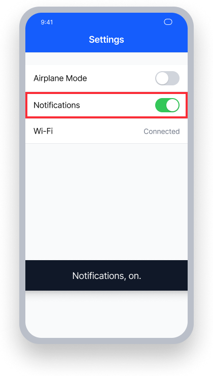
VoiceOver can focus the 'Notifications' toggle but cannot activate it
VoiceOver announces "Notifications, on." - no role or activation hint is provided
Double-tapping does nothing; users have no way to toggle the setting
Passing Example ✅
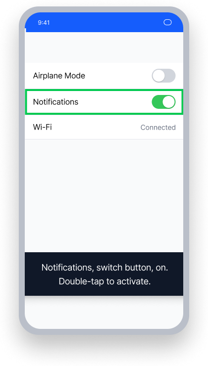
VoiceOver can focus and activate the 'Notifications' toggle
VoiceOver announces "Notifications, switch button, on. Double-tap to activate."
The role and activation hint are present; users know exactly how to interact with the control
At a Glance
- This rule has a critical impact for users
- This rule flags interactive elements that VoiceOver cannot focus on or activate
- This happens when an element is not focusable itself and is not inside a focusable parent
- An interactive element that is inside a focusable parent is inaccessible when no action, gesture recognizer, or activation point is detected
Impact to Users
Assistive technology users are most impacted. When VoiceOver can focus on an interactive element but cannot activate it, users may be unable to complete critical actions - such as submitting a form, toggling a setting, or navigating to another screen. This creates a complete barrier for people who rely solely on VoiceOver to interact with the app.
Confirm Inaccessible Action Issue
- Turn on VoiceOver
- Focus on the element
- One of the following will happen:
- Inaccessible: The user will not be able to activate the element using VoiceOver
- Accessible: The user will be able to use VoiceOver to activate the element
Fix Issues
There are various scenarios that may result in an Inaccessible Action issue. The fix depends on how the element is structured. Review the approaches below, and use the one that corresponds to your layout.
UIKit
There are several approaches, depending on how the element is structured.
Fix in Storyboard — ensure the active control is an accessibility element:
- Select the element with an
InaccessibleActionissue. - Ensure that the Inspectors Panel is visible.
- Select the Identity Inspector.
- Under Accessibility, ensure the "Enabled" checkbox is selected for the active control.
An alternative option is to change the element's accessibility path:
- Repeat steps 1–3 for the active control, its label, and the containing element.
- Ensure the "Enabled" checkbox is selected for the active control only, not for the label or the containing element.
- In code, update the accessibility path to include both the label and the active control (see the accessibility path fix in code below).
Another solution is to center the active control within its parent so VoiceOver's default activation point can reach it:
- Select the element with an
InaccessibleActionissue. - Ensure that the Inspectors Panel is visible.
- Select the active control.
- Select the Size Inspector.
- Ensure that the active control is centered horizontally and vertically within its containing element.
Fix in code:
Ensure the active control's isAccessibilityElement is set to true:
buttonContainerView.isAccessibilityElement = trueAdd a tap gesture recognizer to the containing view:
buttonContainerView.addGestureRecognizer(UITapGestureRecognizer(target: self, selector: #selector(buttonTapped)))Center the active control within the parent view so VoiceOver's accessibilityActivationPoint will trigger its action:
buttonContainerView.button.centerXAnchor.constraint(equalTo: buttonContainerView.centerXAnchor).isActive = true
buttonContainerView.button.centerYAnchor.constraint(equalTo: buttonContainerView.centerYAnchor).isActive = true
Update the accessibility path to include both the label and the active control.
Set isAccessibilityElement=false on the label and the parent element, so that only the control itself (the toggle, in this case) should be an accessibility element.
// 1. Only the toggle should be an accessibility element
toggleContainerView.toggle.isAccessibilityElement = true
toggleContainerView.label.isAccessibilityElement = false
toggleContainerView.isAccessibilityElement = false

// 2. Expand the toggle's accessibilityPath to encompass the full container
// so VoiceOver's focus ring covers both the label and the toggle
let containerFrame = toggleContainerView.superview!.convert(toggleContainerView.frame, to: toggleContainerView.superview)
toggleContainerView.toggle.accessibilityPath = UIBezierPath(rect: containerFrame)
SwiftUI
This issue will not occur on most default elements and controls in SwiftUI, but can occur with custom controls or when elements are grouped incorrectly.
When building custom controls that mimic the behavior of a stepper, slider, or toggle, use .accessibilityRepresentation to give the custom control the same accessibility behavior as its standard counterpart:
// Add .accessibilityRepresentation on a custom Toggle view
HStack {
    Text("Dark mode is \(getDarkModeStatus().localized)")
    Image(systemName: getDarkModeImage())
}.onTapGesture {
    isOn.toggle()
}
.accessibilityRepresentation {
    Toggle(isOn: $isOn, label: {
        Text("Dark mode is \(getDarkModeStatus().localized)")
    })
}
When grouping views together, use .accessibilityElement(children: .combine) or .accessibilityElement(children: .contain) to ensure all actions on child controls remain accessible:
VStack(alignment: .leading) {
    Text("Adjust settings below")
        .accessibilityElement(children: .ignore)
    Divider()
    Toggle(isOn: $isOn) {
        Text("Dark Mode is \(toggleStateText())")
    }
    .accessibility(value: Text("Dark Mode is \(toggleStateText())"))
}
.accessibilityElement(children: .combine)
.accessibilityLabel(Text("Adjust settings below"))
If the containing view has an adjustable control like a stepper or slider, use .accessibilityAdjustableAction to provide the best accessibility experience:
VStack {
    Text("Adjust the stepper below to update dog petting data".localized)
    Divider()
    HStack {
        Stepper(value: $value) {
            Text("Total dogs pet today \($value.wrappedValue)")
        }.accessibilityElement(children: .ignore)
    }
}
.accessibilityElement(children: .combine)
.accessibilityValue(Text("\($value.wrappedValue)"))
.accessibilityAdjustableAction({ direction in
    switch direction {
    case .increment:
        value += 1
    case .decrement:
        value -= 1
    @unknown default:
        print("unknown direction used")
    }
})
React Native
This issue is uncommon for standard touchable or pressable controls in React Native, but may occur with custom controls.
Option 1: Allow the parent view to handle focus
Set the containing view's accessible property to true and accessibilityElementsHidden to false, and assign the appropriate accessibilityRole:
<View
  accessible={true}
  accessibilityElementsHidden={false}
  accessibilityRole='link'
  accessibilityLabel='Learn more about Deque'
  onTouchStart={openLink}
>
  <Image
    source={DequeLogo}
    style={{ width: 100, height: 100 }}
  />
</View>
Option 2: Allow the element itself to handle focus
Set accessible, accessibilityElementsHidden, and accessibilityRole directly on the control:
<Image
  source={DequeLogo}
  accessible={true}
  accessibilityElementsHidden={false}
  accessibilityRole='link'
  accessibilityLabel='Learn more about Deque'
  onTouchStart={openLink}
  style={{ width: 100, height: 100 }}
/>
Flutter
Flutter's Material widgets (ElevatedButton, IconButton, etc.) expose tap actions to the screen reader automatically. When building custom interactive elements with GestureDetector, wrap them in MergeSemantics with a Semantics widget to ensure the screen reader can discover and activate the element in a single focus stop.
MergeSemantics(
  child: Semantics(
    button: true,
    label: 'Archive item',
    child: GestureDetector(
      onTap: () {},
      child: Container(
        padding: const EdgeInsets.all(12.0),
        color: Colors.green.shade100,
        child: const Text('Archive item'),
      ),
    ),
  ),
)
Can I Ignore This Rule?
Inaccessible Action has a Critical impact for users, and we strongly recommend fixing these issues. Because this is an experimental rule, you should verify results manually. If you have confirmed the element is activatable by VoiceOver, it may be acceptable to ignore the finding. Learn more about ignoring rules.
Resources
Deque University Course Pages
Note: Full access to Deque University resources requires a subscription.
Other Resources
- Web Content Accessibility Guidelines (WCAG) 2.1, W3C Recommendation
- WCAG 2.1 Understanding Docs