
Color Contrast
Make sure text is readable for all users


Learn how we're using artificial intelligence for this rule!
What We Check For
Ensure the color contrast between text and its background meets WCAG 2 AA minimum ratio thresholds.
According to WCAG 2.0 1.4.3 AA, the visual presentation of text must have a contrast ratio of at least 4.5:1 for regular text and 3:1 for large text. Large text is defined as at least 18pt or 14pt bold.
Failing Example ❌
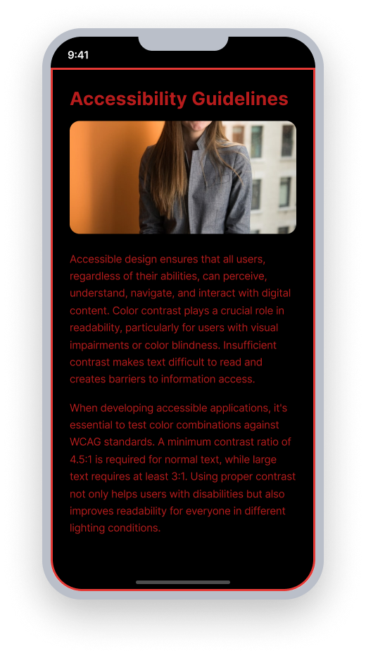
Contrast ratio falls below the 4.5:1 minimum for normal text and 3:1 for large text
Text is difficult to distinguish from the background
Users with low vision may be unable to read this text
Passing Example ✅
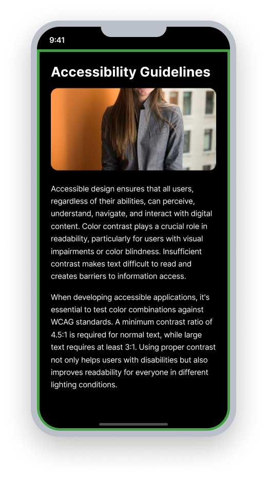
Contrast ratio meets or exceeds the 4.5:1 minimum for normal text
Text is clearly distinguishable from the background
Users with low vision can read this text without difficulty
At a Glance
- This rule has a serious impact for users
- Regular text must have a contrast ratio of at least 4.5:1 against its background
- Large text (at least 18pt or 14pt bold) must have a contrast ratio of at least 3:1
- This rule checks the color contrast of static text elements and text within interactive elements
- This rule uses AI to detect contrast issues - results may need manual verification on complex backgrounds
Impact to Users
The level of color contrast impacts how easy or hard it is to distinguish text from its background. When text and background colors are too similar in brightness, the text becomes difficult or impossible to read.
This affects anyone in low-light conditions, outdoors in sunlight, or using an older screen — but it’s especially a problem for users with low vision. What looks like a readable label to one user may appear as a nearly invisible blur to another.
Confirm Color Contrast Issue
- Do one of the following:
- Open your app in a simulator, OR
- Take a screenshot of the app on your physical device. Send the screenshot to yourself and open it on your computer.
- Use a color picker to:
- Get the truest color of the text element.
- Get the truest color of each distinct background color behind the text.
- Input each color into the Deque Color Palette Contrast Checker.
- You will find one of the following:
- Accessible: The color contrast ratio meets the required minimum for its text size.
- Inaccessible: The color contrast ratio does not meet the required minimum for its text size.
Fix Issues
Color contrast issues occur when the text color and background color are too similar in brightness. To fix the issue, use Deque's Color Contrast Analyzer to find colors that meet the required minimum based on text size. Adjust either the text color or the background color until the required contrast ratio is achieved.
Can I Ignore This Rule?
Color Contrast has a Serious impact for users. Adequate color contrast is a WCAG AA requirement, so this should be a priority fix. In rare cases it may be acceptable to ignore this rule — for example, if text is purely decorative and conveys no information. Learn more about ignoring rules.
Frequently Asked Questions
Are there any known limitations with this rule?\
Yes.
- This rule uses machine learning, and variations in detection may vary from run to run.
- Small devices and/or small text may produce unreliable Color Contrast results due to low pixel density. For the most accurate read of colors visibly displayed on device, we recommend testing on standard and larger devices.
- This rule may produce inaccurate results when text sits on a background with many colors, such as a gradient, image, or semi-transparent background. If you believe a finding is incorrect, use the Deque Color Contrast Analyzer to confirm the ratio between the text and background colors.
- The Color Contrast rule uses Apple's Vision framework (Optical Character Recognition, or OCR) to read text inside an element's bounds. OCR can occasionally misidentify small icon-like glyphs - such as back-arrow chevrons (<), bullets, decorative symbols - as text. When that happens, the Color Contrast rule runs on an element that contains no readable text, which can produce a result for an icon-only button. Because OCR output isn't deterministic across scans, the same element may appear in Color Contrast results in one scan and be reported as "INAPPLICABLE" in the next. This is a known characteristic of OCR, not a bug in the rule. To work around this issue, you can use the
ignoreAPIs to suppress Color Contrast results for the affected elements. Learn more about ignoring rules.
Resources
Deque University Course Pages
Note: Full access to Deque University resources requires a subscription.