
Touch Target Size
Ensure interactive controls are large enough to tap accurately


What We Check For
All interactive elements should have a minimum size of 44pt by 44pt, for both the visual and tappable areas.
The hit area of an interactive element can potentially be expanded beyond its visual bounds - for example, by attaching a gesture recognizer with a larger activation region. After careful consideration, Deque maintains that it's best practice to have the visual and interactive bounds of the target align. This gives the end-user a clear area to engage with for the best chance of success. Therefore, this rule is also testing that the visual bounds of interactive elements meet the minimum 44pt.
Failing Example ❌
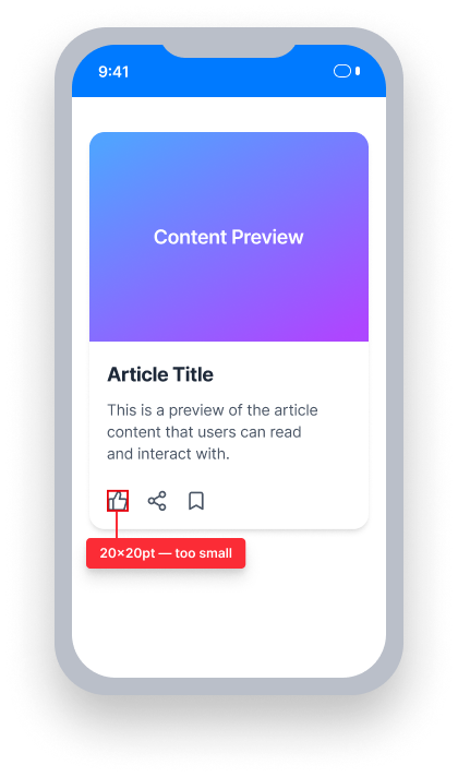
Touch target size = 20pt × 20pt
This element is smaller than the 44pt × 44pt minimum
The tap area is too small to reliably activate, especially for users with motor limitations
Passing Example ✅
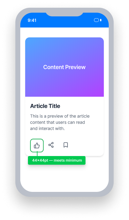
Touch target size = 44pt × 44pt
This element meets the 44pt × 44pt minimum
Both the visual and tappable bounds are large enough to activate accurately.
At a Glance
- This rule has a moderate impact for users
- All interactive elements must have a visual and tappable frame of at least 44pt × 44pt
- Both the visual and interactive (hit area) bounds must meet the minimum
- Small controls are a usability problem for everyone, and especially problematic for users with motor limitations
Impact to Users
On a touch device, small controls are a usability issue for everyone. Additionally, people experiencing motor limitations have increased difficulty interacting with, and aiming for, small targets.
Confirm Touch Target Size Issue
Run the application within Xcode and navigate to the screen containing the interactive element to test.
- Within Xcode, select Debug View Hierarchy
- Select the element to test
- Open the Inspectors Panel if not visible
- Select the Size Inspector
- Observe the width and height of the selected element
If the width or height is less than 44pt, the element fails this rule.
Fix Issues
To resolve Touch Target Size issues, ensure that the visual frame of each interactive element is at least 44pt × 44pt. Both the visual bounds and the tappable hit area should match — expanding only the touch area through a gesture recognizer alone is not sufficient.
An issue found by this rule occurs when the frame of an active control does not have a height and width of 44pt or more.
UIKit
Set the frame of the interactive element to at least 44pt × 44pt using one of the following approaches.
In storyboard:
- Navigate to the interactive element
- Open the Inspectors Panel if not visible
- Select the Size Inspector
- Under
View, update thewidthandheightparameters to at least 44pt
In code:
Update the width and height of the interactive element's frame to at least 44pt.
This may be set through the initializer and a specific frame:
let button = UIButton(frame: CGRect(x: 0, y: 0, width: 44, height: 44))or, may be set through view constraints. If there is a current constraint on the button, go ahead and update the width and height to be a minimum of 44 points. Otherwise, you can add constraints:
// Update Height:
myButton.heightAnchor.constraint(greaterThanOrEqualToConstant: 44).isActive = true

// Update Width:
myButton.widthAnchor.constraint(greaterThanOrEqualToConstant: 44).isActive = true
SwiftUI
Apply a .frame modifier to expand controls to at least 44pt × 44pt.
TextFields
Please note that currently in SwiftUI there is no consistent way to increase the size of the tappable area of a TextField, so a SwiftUI TextField will return .INCOMPLETE for this rule. A radar report has been filed with Apple.
Buttons
Use a frame modifier on the contents of the label parameter rather than on the entire button.
- Use the
Button's label-based initializer, which has 'action' as the first parameter and 'label' as the second parameter as shown below.
Button(action: {
  print("Button tapped")
  }, label: {
  Text("Tap here")
  }
)- Add a frame modifier to the contents of the Button's
labelparameter, specifying a height and width of at least 44.
Button(action: {
  print("Button tapped")
  }, label: {
  Text("Tap here")
    .frame(width: 80, height: 45)
  }
)
React Native
Use platform-specific size properties to ensure controls meet the minimum touch target size.
Some components from React Native are not customizable to allow for size adjustments, such as the Button component.
If possible, ensure all interactive elements are at least 44pt by 44pt. If not possible, explore alternative components that do allow you to adjust the size.
Tip: When using custom controls, be sure the accessibility role is set properly!
Flutter
Flutter's Material widgets (ElevatedButton, IconButton, etc.) enforce a 48pt by 48pt minimum touch area automatically, so they meet this requirement by default. Violations typically come from custom tap targets built with GestureDetector, which does not expand the tap area beyond the visual size.
  // Failing — tap target is only 24×24
  GestureDetector(
    onTap: () {},
    child: Container(
      width: 24,
      height: 24,
      color: Colors.blue,
      child: const Icon(Icons.close, size: 16, color: Colors.white),
    ),
  )

  // Passing — tap target meets 44×44 minimum
  GestureDetector(
    onTap: () {},
    child: Container(
      width: 44,
      height: 44,
      color: Colors.blue,
      child: const Icon(Icons.close, size: 24, color: Colors.white),
    ),
  )
Can I Ignore This Rule?
Touch Target Size has a Moderate impact for users. In cases where a design constraint prevents meeting the 44pt minimum — such as a toolbar icon in a very dense interface — document the decision and explore alternatives before ignoring the rule. Learn more about ignoring rules.
Resources
Deque University Course Pages
Note: Full access to Deque University resources requires a subscription.
Other Resources
- Web Content Accessibility Guidelines (WCAG) 2.1, W3C Recommendation
- WCAG 2.1 Understanding Docs