
Nested Focusable Element
Don't steal focus from a clickable parent by making a child element focusable
What We Check For
Focusable elements should not be nested within clickable parent elements. When a non-interactive child element is focusable, assistive technology focuses on it instead of the clickable parent — meaning the element's interactive role is never announced.
This rule checks all accessibility-focusable controls that are not themselves interactive. If such a control is contained within a clickable parent, it is inherently interactive, but will not announce a role. The element will be flagged as an accessibility violation.
Failing Example ❌
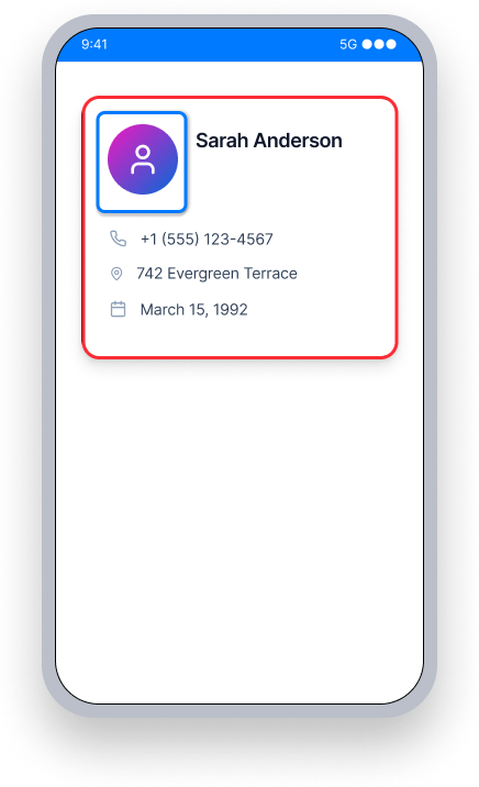
The card is clickable, but the profile picture inside it is separately focusable.
TalkBack does not announce the card's role or "Double-tap to activate" hint, and instead focuses on and announces the inner element.
Users don't know the card is interactive, and the element with focus is not clickable.
Passing Example ✅
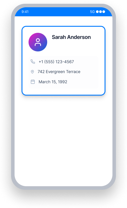
The inner element is no longer separately focusable.
TalkBack focuses on the card itself and announces its content, role, and "Double-tap to activate."
Users understand the card is interactive and can activate it.
At a Glance
- This rule has a Critical impact for users of TalkBack and Voice Access
- When a child element steals focus from a clickable parent, the interactive role is lost
- TalkBack will not announce "Double-tap to activate" if the focused element is not itself clickable
- The fix is always to remove focusability from the nested element, not to add a role to it
- Container views that have no action should not be left clickable — this avoids false positives
Impact to Users
When assistive technology does not announce a role, blind or low-vision users relying on TalkBack will not know they can trigger an action. For example, TalkBack focuses on an inner element and announces only its text (e.g. "Theme"). It does not announce that it is a button, or that the user should double-tap to activate. Users are left without the context they need to interact with the screen.
Confirm Nested Focusable Element Issue
- Turn on TalkBack
- Focus on the element and each of its descendants
- One of the following will happen:
- Inaccessible: TalkBack reads the text but does not announce a role or ability to interact
- Accessible: TalkBack reads all text and also announces a role and/or how to interact with the element
Fix Issues
Remove focusability from nested elements so the clickable parent can gain focus and announce its role. Do not add focusable properties to non-interactive descendants of a clickable view.
To avoid a false positive finding, ensure container elements that do nothing when tapped are not left clickable. Our tools cannot determine if a clickable element has an associated programmed action, so we must assume that it does in order to flag potentially inaccessible behavior.
Examine surrounding container elements, such as Frame Layouts, Card Views, or Drawers, to make sure that any element without an associated action is not set as clickable.
XML
In the example below, the MaterialCardView is clickable, but if one of the children - LinearLayout or TextView - has focusable="true" TalkBack will focus on that instead of the card. In its default state the focusable property of both LinearLayout and TextView is false. Ensure that it is not set to true, so the card can gain focus and announce its interactive role.
<com.google.android.material.card.MaterialCardView
    android:layout_width="wrap_content"
    android:layout_height="wrap_content"
    android:clickable="true">

    <LinearLayout
        android:layout_width="wrap_content"
        android:layout_height="wrap_content"
        android:layout_margin="10dp">

        <TextView
            android:layout_width="wrap_content"
            android:layout_height="wrap_content"
            android:text="@string/contact_name"/>

    </LinearLayout>

</com.google.android.material.card.MaterialCardView>
Compose
In this example, the Card is clickable, but if one of the children - Row or Text - has a .focusable() attribute, TalkBack will focus on it instead. Ensure the Row or Text does not have a .focusable() attribute, so the Card can gain focus, announce its text content, and convey its interactive role (e.g."Double-tap to activate").
Card(
    modifier = Modifier
        .clickable {
            openContact(context)
        }
) {
    Row(
        modifier = Modifier
            .padding(10.dp),
        horizontalArrangement = Arrangement.spacedBy(10.dp, Alignment.CenterHorizontally)
    ) {
        Text("Sarah Anderson")
    }
}
.NET MAUI
In the example below, the contact card Grid has a TapGestureRecognizer to open the contact. If a child element inside the Grid is independently focusable, TalkBack will focus on it instead of the card. Ensure that no child element has AutomationProperties.IsInAccessibleTree="true" set explicitly, so the Grid retains focus and can announce "Double-tap to activate".
<Grid
    HorizontalOptions="FillAndExpand"
    RowDefinitions="Auto,Auto"
    RowSpacing="10"
    VerticalOptions="FillAndExpand">

    <Grid.GestureRecognizers>
        <TapGestureRecognizer Command="{Binding OpenContactCommand}"/>
    </Grid.GestureRecognizers>

    <Label
        Grid.Row="1"
        FontAttributes="Bold"
        FontSize="16"
        HorizontalOptions="CenterAndExpand"
        VerticalOptions="FillAndExpand">
        <Label.FormattedText>
            <FormattedString>
                <Span Text="Sarah Anderson"/>
            </FormattedString>
        </Label.FormattedText>
    </Label>
</Grid>
React Native
In this example, the contact card is a TouchableOpacity with accessibility properties set directly on it. The properties accessible={true} and accessibilityRole="button" ensure TalkBack announces the card as an interactive element. Any child views inside it should not have accessible={true} set independently, which would cause them to steal focus from the card.
<TouchableOpacity
    accessible={true}
    accessibilityRole="button"
    style={styles.contactCard}
    onPress={() => openContact("sarah-anderson")}
>
    <Text>Sarah Anderson</Text>
    <Text>sarah@example.com</Text>
</TouchableOpacity>
Flutter
In this example, the contact card is a Card with an InkWell handling the tap. If a child widget inside the Card has its own Semantics wrapper with button: true or onTap set, TalkBack will focus on it instead of the card. Keep the tap handler on the InkWell and ensure no descendant widget independently claims focus.
Card(
  child: InkWell(
    onTap: () => openContact(context, "sarah-anderson"),
    child: const Padding(
      padding: EdgeInsets.all(16.0),
      child: Column(
        crossAxisAlignment: CrossAxisAlignment.start,
        children: [
          Text("Sarah Anderson"),
          Text("sarah@example.com"),
        ],
      ),
    ),
  ),
)
Can I Ignore This Rule?
Nested Focusable Element has a Critical impact for users, and we strongly recommend fixing this issue. When focus lands on a non-interactive element inside a clickable parent, TalkBack users have no way to know the element can be activated. Ignoring this rule means those users effectively cannot interact with the affected element. Learn more about ignoring rules.
Resources
Deque University Course Pages
Note: Full access to Deque University resources requires a subscription.
Other Resources
- Web Content Accessibility Guidelines (WCAG) 2.1, W3C Recommendation
- WCAG 2.1 Understanding Docs