
CheckBox Name
What We Check For
Any CheckBox element should have an accessible name available for assistive technologies such as TalkBack and Voice Access.
Failing Example ❌
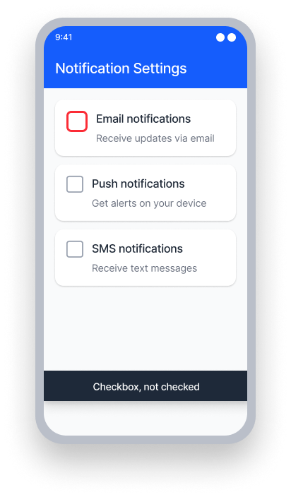
name = {none}
TalkBack announces only the value and role
"Checked, CheckBox"
Voice Access - User speaks "Subscribe to newsletter"
This won't activate the checkbox since it has no name
Passing Example ✅
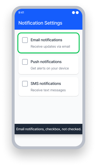
name = "Subscribe to newsletter"
TalkBack announces the name, value, and role
"Subscribe to newsletter, Checked, CheckBox"
Voice Access - User speaks "Subscribe to newsletter"
This activates the checkbox because the name matches
At a Glance
- This rule has a Serious impact for users
- Every checkbox needs a name: users relying on TalkBack or Voice Access must be able to identify and interact with checkboxes
- Associate a visible label: use a
TextView(XML) or aTextcomponent (Compose) linked to the checkbox - Avoid using both
TextandContentDescriptionproperties together — they conflict with each other
Impact to Users
People using assistive technology such as TalkBack and/or Voice Access are impacted most by issues detected by this rule.
When a CheckBox has no accessible name, TalkBack announces only its value and role — for example, "Checked, CheckBox" — leaving the user with no context about what they are selecting. This makes it impossible to understand the purpose of the control without additional exploration, and prevents Voice Access users from activating the checkbox by speaking its label.
Confirm CheckBox Name Issue
- Turn on TalkBack
- Attempt to focus the control
- One of the following will happen:
- Inaccessible: TalkBack only announces the value and role.
- Accessible: Both the name and value are read by TalkBack.
Fix Issues
To resolve a CheckBox Name issue, ensure every checkbox has an accessible name by associating it with a visible text label. This way TalkBack will announce a meaningful name alongside the checkbox's value and role. Voice Access users will be able to activate the checkbox by speaking its label.
XML
Associate a TextView with the CheckBox using the labelFor attribute. This links the visible label to the checkbox so that TalkBack announces the label text as the checkbox's accessible name.
  <LinearLayout
      android:layout_width="wrap_content"
      android:layout_height="wrap_content"
      android:orientation="horizontal">

      <CheckBox
          android:id="@+id/subscribe_checkbox"
          android:layout_width="wrap_content"
          android:layout_height="wrap_content" />

      <TextView
          android:layout_width="wrap_content"
          android:layout_height="wrap_content"
          android:text="Subscribe to newsletter"
          android:labelFor="@id/subscribe_checkbox" />

  </LinearLayout>
If the views are created programmatically, or the association cannot be made in XML, use setLabelFor to link the label to the checkbox in code.
TextView label = findViewById(R.id.checkbox_label);
CheckBox checkBox = findViewById(R.id.subscribe_checkbox);
label.setLabelFor(checkBox.getId());Do not set a ContentDescription on the CheckBox if you are already using a visible text label. When both are present, TalkBack reads the ContentDescription value and ignores the label, causing a mismatch between what is displayed on screen and what is announced.
Compose
Wrap the Checkbox and a text element inside a parent element with the Checkbox accessibility role, and ensure the checkbox's action can be invoked by selecting the parent element.
Row(modifier = Modifier
    .toggleable(
        value = checkedState,
        enabled = true,
        role = Role.Checkbox, // Parent element has the accessibility role
        onValueChange = { setCheckBoxState(!checkedState) } //
    )
    .semantics(mergeDescendants = true) { }
    .constrainAs(labeledTextField) {
        setConstraints(top = parent.top, start = parent.start, end = parent.end)
    }
) {
    Checkbox(
        checked = checkedState,
        modifier = Modifier.padding(16.dp),
        onCheckedChange = null
    )

    Text(text = "Get Marketing emails", modifier = Modifier.padding(16.dp))
}
React Native
Note: The React Native checkbox component has been deprecated, so this will only apply when using a third-party checkbox element, or when creating a custom element.
To combine a checkbox and label in React Native, you can wrap both elements within a TouchableOpacity:
<TouchableOpacity
   style={{flexDirection:'row', alignItems: 'center',}}
   onPress={() => {
     setSelection(!isSelected)
     }
   }
   accessible={true}
   accessibilityLabel={"Do you like React Native?"}
   accessibilityRole='checkbox'>
     <CheckBox
       importantForAccessibility='no-hide-descendants'
       value={isSelected}
       onValueChange={setSelection}
       style={styles.checkbox}
      />
     <Text>Do you like React Native?</Text>
</TouchableOpacity>
To ensure this works correctly for all users:
- Set
accessible={true}on theTouchableOpacityso assistive technology focuses the group as a single element - Set
accessibilityLabelto match the visible text label exactly - Set
accessibilityRoletocheckboxto provide the correct context to assistive technology users - Set
importantForAccessibility='no-hide-descendants'on theCheckBoxso it cannot be individually focused - Add an
onPressaction to theTouchableOpacityfor handling the checkbox toggle
Can I Ignore This Rule?
CheckBox Name has a Serious impact for users, and we recommend remediating this issue in nearly all cases. A checkbox with no accessible name provides no context to assistive technology users and prevents Voice Access interaction entirely. Learn more about ignoring rules.
Resources
Deque University Course Pages
-
See Native Mobile Android under 4.1.2 Name, Role, Value (A)
Note: Full access to Deque University resources requires a subscription.
Other Resources
- Web Content Accessibility Guidelines (WCAG) 2.1, W3C Recommendation