
Switch Name


What We Check For
Any Switch element should have an accessible name that describes its purpose for assistive technologies such as TalkBack and Voice Access.
Failing Example ❌
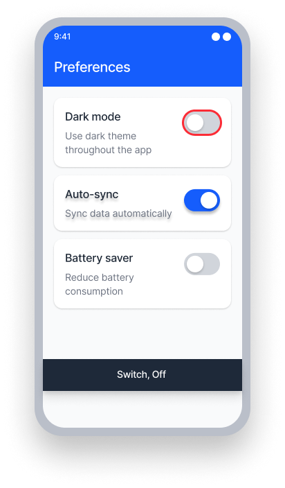
Switch has no accessible name.
TalkBack reads "Off, Switch."
Voice Access — user has no visible label to speak to activate the switch.
Passing Example ✅
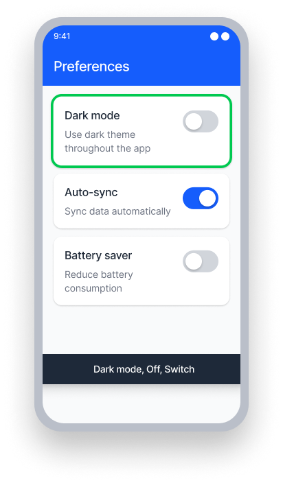
Switch is labeled with visible text via labelFor or grouping.
TalkBack reads "Dark Mode, Off, Switch."
Voice Access — user speaks "Dark Mode" to activate the switch.
At a Glance
- This rule has a critical impact for users
- Every switch needs an accessible name that describes what it controls
- A name like "Dark Mode" is far more useful than no name at all
- The name should come from a visible label when possible, using
labelForor grouping techniques - Avoid setting a content description directly on the Switch unless the state (e.g. 'on'/'off') is preserved
Impact to Users
People who are blind, have low vision, or use switch access rely on the accessible name to understand what a switch does before interacting with it. Without a name, TalkBack only announces 'on' or 'off' — giving users no context about what they're controlling.
When a switch and its visible label are separate elements, focus order matters. If TalkBack comes to the switch before the label, it may announce only the state and not the name. Use labelFor or group the elements together to ensure the name and switch are announced as one.
Confirm Switch Name Issue
- Turn on TalkBack
- Attempt to focus on a
Switchelement - One of the following will occur:
- Inaccessible: TalkBack only announces 'on' or 'off'.
- Accessible: TalkBack announces the name of the switch and 'on' or 'off'.
Fix Issues
A switch needs an accessible name so assistive technology can announce what the switch controls. The best approach is to group or link the label and the switch so they are treated as a single accessible element.
XML
You may provide a label in the neighboring element or wrap the switch with its label. You may also manipulate the contentDescription, but be sure to retain the 'on' and 'off' state for TalkBack announcements.
layouts/activity.xml
<TextView
     android:id="@+id/label"
     android:text="@string/label_text"
     android:labelFor="@+id/switch">
<Switch
     android:id="@+id/switch"/>

...

strings.values/
<string name="label_text">Dark Mode</string>
Compose
Group a Text and Switch into a merged layout such as a Row. Apply the switch role and toggleable modifier to the Text, and clear semantics on the Switch using Modifier.clearAndSetSemantics { }. This way TalkBack will focus on the label, rather than the switch element directly.
val (isSwitchChecked, setSwitchState) = remember {
    mutableStateOf(true)
}

Row(modifier = Modifier.semantics(mergeDescendants = true) { }) {
    Text(
        text = "Get Emails",
        modifier = Modifier
            .toggleable(
                value = isSwitchChecked,
                onValueChange = {
                    setSwitchState(!isSwitchChecked)
                },
                role = Role.Switch
            )
    )

    Switch(
        checked = isSwitchChecked,
        onCheckedChange = {
            setSwitchState(!isSwitchChecked)
        },
        modifier = Modifier
            .clearAndSetSemantics { }
    )
}
React Native
To combine a switch and label in React Native, wrap both components within a TouchableOpacity component:
<TouchableOpacity
   onPress={() => {
     setSwitchOn(!switchOn)
     Alert.alert("Switch on : " + !switchOn)}}
   style={styles.subContainer}
   accessible={true}
   accessibilityLabel={"Subscribe"}
   accessibilityRole='switch'>
      <Text style={{ fontSize: 22 }}>
         Subscribe
      </Text>
      <Switch
         importantForAccessibility='no-hide-descendants'
         onValueChange={() => {
            setSwitchOn(!switchOn)
            Alert.alert("Switch on : " + !switchOn)} }
        value={switchOn}
   />
</TouchableOpacity>
To ensure this works correctly for all users:
- Set
accessible={true}on theTouchableOpacityso the group is focused together - Ensure the
accessibilityLabelproperty of theTouchableOpacitymatches the visible text label exactly - Set the
accessibilityRoletoswitchto communicate the correct control type - Set
importantForAccessibility='no-hide-descendants'on theSwitchelement so that it cannot be individually focused - Add an
onPressaction for handling the behavior of the switch when activated
Can I Ignore This Rule?
Switch Name has a Critical impact for users. A switch without an accessible name cannot be understood or used by screen reader users. We strongly recommend fixing this issue in all cases. Learn more about ignoring rules.
Resources
Deque University Course Pages
- See Native Mobile Android under 4.1.2 Name, Role, Value (A)
Note: Full access to Deque University resources requires a subscription.
Other Resources
- Web Content Accessibility Guidelines (WCAG) 2.0, W3C Recommendation - Success Criterion 4.1.2 - Name, Role, Value
- WCAG 2.1 Understanding Docs - Understanding 4.1.2 A - Name, Role, Value