
Touch Target Spacing
Ensure interactive elements are spaced apart enough to tap accurately


Learn how we're using artificial intelligence for this rule!
What We Check For
Interactive elements should have a minimum dimension of 24dp by 24dp, or have enough padding around it so that if a circle with a diameter of 24dp is placed on the center of the element, the circle will not intersect with another target nor with the circle for another target.
The touch area of an interactive element can potentially be expanded beyond its visual bounds - for example, by using a TouchDelegate to increase the active touch region. After careful consideration, Deque maintains that it's best practice to have the visual and interactive bounds of the target align. This gives the end-user a clear area to engage with for the best chance of success. Therefore, this rule is also testing that the visual bounds of interactive elements meet the minimum 24dp.
What's the difference between Touch Target Spacing and Touch Target Size?
Touch Target Spacing targets WCAG 2.2 AA compliance with a 24dp minimum, whereas Touch Target Size more closely aligns with Google's recommendation of 48dp by 48dp. We highly recommend supporting both rules - compliance with Google's guidelines helps ensure there are no issues when submitting to the Play Store.
Failing Example ❌
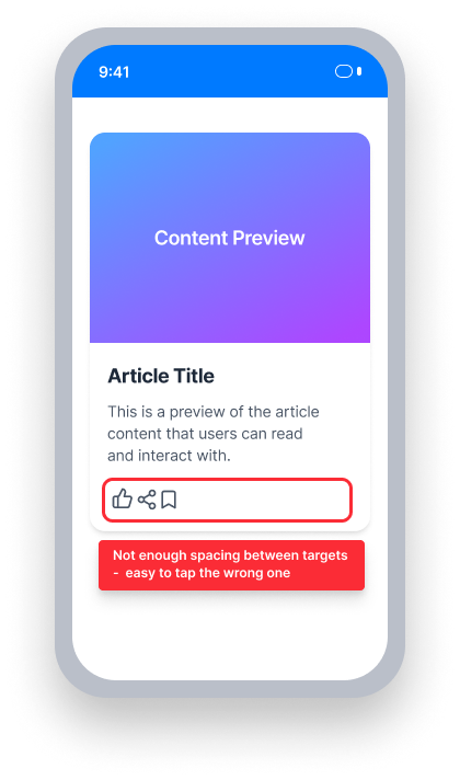
Touch target spacing is insufficient
These controls are too close together - a 24dp-diameter circle centered on one overlaps the other
Users with motor limitations may accidentally activate the wrong element
Passing Example ✅
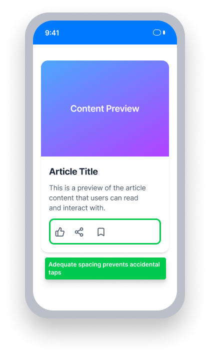
Touch target spacing is sufficient
Each control is either at least 24dp × 24dp, or has enough surrounding space that a 24dp-diameter circle centered on it does not intersect any adjacent target
At a Glance
- This rule has a serious impact for users
- Interactive elements must be at least 24dp × 24dp, OR positioned so that a 24dp-diameter circle centered on the element doesn't overlap any adjacent target
- Both the visual and interactive (hit area) bounds must meet the minimum
- Sliders must maintain at least 24dp of space along their length
Impact to Users
On a touch device, small controls are a usability issue for everyone. Furthermore, people experiencing motor limitations have increased difficulty interacting with small targets that are too close together to activate independently.
Confirm Touch Target Spacing Issue
Run the application and navigate to the screen containing the element to test.
- In Android Studio, open the Layout Inspector (Tools > Layout Inspector)
- Select the element to test in the component tree or canvas
- In the Attributes panel, observe the width, height, and position of the selected element relative to neighboring interactive elements
- If necessary, identify the device's pixel density to confirm dp values
One of the following outcomes applies:
- Passes: The element is at least 24dp × 24dp, and there are no overlapping elements that reduce the available tappable area below the minimum
- Passes: The element is smaller than 24dp × 24dp, but the padding around it is large enough that a 24dp-diameter circle centered on the element does not intersect any adjacent target
- Passes: Sliders maintain at least 24dp of space along the length of the element
- Fails: The element is smaller than 24dp × 24dp, with insufficient spacing between itself and adjacent interactive elements
- Fails: A neighboring interactive element reduces the tappable area of the tested element below the minimum threshold
Fix Issues
To resolve Touch Target Spacing issues, ensure each interactive element is either at least 24dp × 24dp or has enough margin that a 24dp-diameter circle centered on it doesn't intersect any adjacent interactive target.
XML
Set minimumHeight and minimumWidth to 24dp, and add margin between neighboring interactive elements.
In code:
Button button = findViewById(R.id.an_accessible_button_yay);
button.setMinimumHeight(24);
button.setMinimumWidth(24);
In layout definition:
<Button
     android:id="@+id/an_accessible_button_yay"
     android:minimumHeight="24dp"
     android:minimumWidth="24dp"
     android:text="@string/batman_likes_accessible_buttons" />
Compose
Use Modifier.defaultMinSize to set a minimum height and width, and padding to add spacing between neighboring interactive elements.
Button(
    modifier = Modifier
        .defaultMinSize(minWidth = 24.dp, minHeight = 24.dp)
        .padding(start = 24.dp, top = 24.dp),
    onClick = { }
) {
    Text(stringResource(id = R.string.button))
}
React Native
Adjust the height and width of interactive elements, and use layout properties to add spacing between them.
const styles = StyleSheet.create({
    button: {
        alignItems: 'center',
        backgroundColor: 'lightblue',
        width: 24,
        height: 24
    }
});
Certain elements don't easily allow size adjustments. These can be wrapped in a View with a flex layout, using the gap property to achieve proper spacing between elements:
<View style={{ flex: 1, flexDirection: 'column', gap: 24 }}>
   <Slider
      step={1.0}
      maximumValue={100}
      style={{ width: 200, height: 60 }}
      value={sliderValue}
      accessible={true}
      onValueChange={setSliderValue}
      onSlidingStart={sliderValue => {
        setSliderValue(sliderValue);
      }}
      onSlidingComplete={sliderValue => {
        setSliderValue(sliderValue);
      }}
      accessibilityValue={{ now: "value: " + a11yValue }}
   />
</View>
Flutter
Flutter's Material widgets enforce a 48pt by 48pt touch area by default, which typically provides adequate spacing. Violations are most likely with custom tap targets built using GestureDetector, where spacing must be managed manually.
// Passing — spacing added between targets
Row(
  spacing: 8.0,
  children: [
    GestureDetector(
      onTap: () {},
      child: Container(
        width: 20,
        height: 20,
        color: Colors.blue,
        child: const Icon(Icons.thumb_up, size: 14, color: Colors.white),
      ),
    ),
    GestureDetector(
      onTap: () {},
      child: Container(
        width: 20,
        height: 20,
        color: Colors.blue,
        child: const Icon(Icons.thumb_down, size: 14, color: Colors.white),
      ),
    ),
  ],
)
Can I Ignore This Rule?
Touch Target Spacing has a Serious impact for users. We recommend remediating this issue except in rare cases where layout constraints make it genuinely infeasible. Learn more about ignoring rules.
Resources
Deque University Course Pages
Note: Full access to Deque University resources requires a subscription.
Other Resources
- Web Content Accessibility Guidelines (WCAG) 2.2, W3C Recommendation
- WCAG 2.2 Understanding Docs